My three latest articles have been dealing with separation between pedestrians and cyclists. These articles are:
- Vådan av att ha rosa hörlurar (the problem with wearing pink head phones)
- Byt cykel mot bil! (exchange bike with car to test your design attitude)
- Jonsson och Hydén om g|c (findings from a deep academic separation study)
Now I want to summarize my thoughts about how to create good separation between pedestrians and cyclists in cities. Göteborg is my main focus. My original article in Swedish has a lot of links to texts written in Swedish to support my view, but most of them are omitted in this English translation.
(Original article from 2015-05-13: Vad är bra gc-separering?)
Prerequisites
The separation effect relies on the ambitions, the physical and the mental prerequisites.
The ambitions of Göteborg are clearly stated in the new bicycle strategy for the coming ten years. On page 20 it says for example “Bicycles should as the basic rule be distinctly separated from other means of transportation – even from pedestrians”. This sentence is also found in the superordinate traffic strategy for Göteborg, so there should be no question about what Göteborg really tries to achieve.
The physical prerequisites is very much about competition for urban space. It is easy to say that all modes of transportation must have good space of their own so they won’t interfere with each other. But the urban space is often a commodity in short supply, and we would probably not want giant space between the city blocks even if we were able to move them apart freely. With limited space comes the need of prioritizing.
The traffic strategy also says on page 33 ”Directness, separation and prioritizing in the traffic network is crucial for the power of attraction of bicycles”.
The mental prerequisites are about what kind of view we really have on the different modes of transportation. Is the bike for real? Like the car? Or is it just a toy? Do we as pedestrians feel that it is important to leave the dedicated bikeways to the cyclists, allowing them to bike in bike speed there? Do we get equally upset when a pedestrian violates the red traffic light as when a cyclist does? Is the police equally strict in looking after the faults of other road users against cyclists as faults of cyclists against others? And are all designers careful about making bikeways distinct in the eyes of pedestrians, or do some of them fiddle about bikeways, making them almost look like pedestrian areas?
Variable need of space
During rush hours when all bike commuters are heading to or from their jobs, we have the promising view of long rows of cyclists along our bikeways. At that time the cyclists would really need good space to be able to overtake each other and not to form a thin but therefore endless barrier for other road users that want to cross.
But at other hours there are often few cyclists, and the pedestrians dominate. If they can’t see any cyclists when they step into a bikeway, they can easily forget about bikes for the rest of their walk. They will seldom turn around to check if they should give way.
It would be very convenient if we had a kind of separation that could magically stretch according to current needs! Or if we as pedestrians could borrow the bikeway but take the responsibility to be out of the way before a cyclist comes. Unfortunately this does not work. It is not a matter of ill will, although our defense mechanism during incidents sometimes could make it look like that.
The bicycle strategy wants to achieve a tripling of biking in the city by the year 2025 compared to 2011. That is a giant leap for mankind! At the same time, cargo bikes and other wide bike vehicles will me more and more common. Our current narrow bikeways, not dimensioned for overtaking, will not be good enough. The question is if we should continue building narrow bikeways for now and broaden them later, or if everything we build from now on should be dimensioned for the goal traffic at 2025. With the limited urban space, you would of course want the allocation to be adapted at all times to current needs. But then there must also be a plan for what to do when the number of cyclists grow. We need long-term planning, and we must not create expensive obstacles going against the future goals of Göteborg.
One example: Why was the tram platform at Södra Vägen near Berzeliigatan built so wide some years ago? You never see this platform crowded, but the bikeway and sidewalk that goes outside it has no room to grow. When the bikeway was changed into two-way traffic, it unfortunately had to steal a portion of the badly needed pedestrian space. Narrowing the newly built tram platform was not an option because it would be too expensive.
Good separation
Good separation must be so obvious so even a child perceives it and can instinctively feel which side is intended for what. We could call this the child test. When we are pedestrians, the actual walking and our choice of where to walk is normally done by our autopilot. Our conscious mind is mostly occupied by completely different things. Therefore the design has to address our autopilot. We must not run the risk of unintentionally stepping into the bikeway. This is the way we have always designed separation from car traffic.
Good separation has well planned entry points. They always lead you in a natural way to the right part of the way from whatever direction you may come.
Good separation offers both cyclists and pedestrians equally good standard. Krister Spolander and Ninnie Gustafsson write in an answer to a request for comments by the Swedish Transport Administration (Trafikverket):
If bikeways have better road surface, it will often be used by pedestrians. A surface with tiles should be avoided. They are virtually always less comfortable than the asphalt surface of the bikeway and causes many pedestrians to choose the bikeway instead. (My translation)
Does it have to be like this, or can we create the aestethics we want without wheeled suitcases bumping all the time, walker rollators deviating from their direction and elderly stumbling on tile edges sticking up from the surface?
The comprehensive study by Jonsson och Hydén on cyclist/pedestrian separation finds that tiles for pedestrians and asphalt for cyclists with a line of small paving stones or a level difference between them gives the best separation effect. These methods have a clear border as well as something that shows all along – not only at certain spots – which side is intended for who.
With level separation it is the levels themselves that show which side is which, but then the child test demands that the levels are different enough to be taken as deliberate. There must be a certain amount of inconvenience to pass the border. Tiles must be used in a consistent way in the urban design to load them with a message that road users can understand. That is, they must be used frequently for pedestrians and never for cyclists. Pedestrians must get an instinctive feeling of being “at home” on tiles while cyclists should feel “away from home” there. Stefan Krii wrote something like this in the traffic blog of the newspaper Göteborgs-Posten:
The Swedish town of Malmö uses almost always asphalt for bikeways and light grey concrete tiles for sidewalks. This makes the traffic environment both functional and easy to understand. (My translation)
Cyclist and pedestrian symbols
The technical manual for traffic design 2014:2 by City of Göteborg, Traffic and Public Transport Authority (Trafikkontoret) states that bikeways and pedestrian paths must always be marked with symbols.
Krister Isaksson (traffic planner, bike expert) writes that bike and pedestrian symbols are quite rare in countries and cities with a developed net of bikeways. There the bike is well established since decades as a serious means of transportation. It makes symbols redundant. Compare this with the fact that we do not find a lot of car symbols on the streets in Swedish cities just to inform other road users that here you should expect cars.
I think that we need a lot of symbols as long as we have not designed our bikeways with enough uniformity to make them able to speak for themselves. When we reach that far, we will only need symbols at some strategic points.
Level difference
Here is a wonderful example:

Good functioning separation with a distinct level difference at Södra Vägen in Göteborg 2014. The pedestrians avoided the bikeway even when the bike traffic flow was very low. Here only two cyclists are seen, far away behind the priority road sign.
The distinct level difference comes from a time when this was a street for motor vehicles. Then a tram platform was built in the middle of the road, leaving only a narrow bikeway next to the sidewalk. The level difference has later been removed completely, but before that I measured the separation effect. And I plan to measure again after the rebuild (which I also did).
The blog “Bike life” by Kim Halderot discusses level separation in one post. From that and from a further link by the Swedish national public TV broadcaster (SVT) we can compare the viewpoints from traffic planners Anne Eriksson in Copenhagen and Christoffer Hedberg in Malmö – two neighbor cities, one on each side of the Danish-Swedisc border strait. In the blog we can also read the viewpoint of Dmitri Fedortchenko at the bike transport company MOVEBYBiKE in Stockholm and of Kim himself.
Anne says that Copenhagen wants to avoid conflicts with pedestrians by means of level separated one-way bikeways on both sides of the road. The number of cyclists increases but accidents drops.
Christoffer in Malmö does not want a level difference between pedestrians and cyclists. He says that the falling accidents for both pedestrians and cyclists might increase. Instead Malmö uses separating strips.
Kim asks himself if sidewalk edges really is a big problem for pedestrians. Against cars, this method of separation has worked excellent in many decades, hasn’t it? But on asphalted bike and pedestrian paths with a separating strip of paving stone only, the pedestrians tend to strut freely all over the place without even reflecting on that they are walking in the bikeway. By separating them using different levels and also by using colored asphalt for the bikeways, a self-evident difference is created that may lower the number of incidents between pedestrians and cyclists.
Dmitri says that level difference is the means that makes pedestrians watch their step, not strolling right out in the road. Pedestrians all over the world are used to curbs as a natural urban feature. Both Copenhagen and the Netherlands use level separation even for bikeways without problems. He can’t see why anyone can discourage from this and even use as a motive that he/she actually wants to make it easier for pedestrians to violate the bikeway border.
Colored bikeways
A major difference between bike and pedestrian areas is that you may walk anywhere, except for certain paths, and it is exactly in those paths you are allowed to bike. It would be very easy for all sighted persons to understand the overall structure if the bikeways always had a dedicated color. In that case this color must only be used where bikes should be given way by others, which is on bikeways and on the new Swedish form of prioritized bike crossings (cykelöverfarter) over roads. Such a bike color can’t give cyclists a formal right of way other than the legal aspects already do, but it will make the situation more obvious for all road users. In places where designers want to give way to pedestrians, the standard means used by the traffic community is to establish a pedestrian crossing. This can if needed be combined with an elevation.
Back in 28 september 2007, Anders Börjesson wrote a debate article in Göteborgs-Posten, supplying two images from the streets of Göteborg where he had colored the bikeways green. He had been impressed by bikeways with green reflecting color at Cagnes-sur-Mer outside Nice. Some local parking guards there had told him that:
- The color makes car drivers extra observant at crossings
- Pedestrians and cyclists can clearly see where the bikeways are. They are often adjacent and on the same level beside the road.
- The bikeways are perceived as cleaner: any glass, sticks and trash pops out.
- Accidents and incidents involving cyclists have been significantly reduced.
- It is inexpensive to color the bikeways.
The article got more than a hundred comments on the newspaper’s web page. Among them was this one from Joris van Rooij:
In the Netherlands the bikeways have been red for years. A red asphalt is used instead of paint. This way it will not get slippery, and it lasts longer. At crossings the bikeways are still red where bikes should be given way, and “shark teeth” symbols are used that shows who should give way. (My translation)
Costs, aestethics and possible problems with slippery surfaces were discussed a lot in the comments. I will not get deeper into this. But surely it would be an exciting thought to give at least the bike commuter network a consistent color, especially in the central parts of Göteborg. As a bonus, this could give biking a viral and promotional effect, provided that the standard of this network is really something to be proud of.
Krister Spolander and Ninnie Gustafsson writes in the same answer to the request for comments as above:
When asphalt is used, its color should be different to visualize the different spaces for pedestrians and cyclists. (My translation)
Separating strips
A separating strip does not by itself tell that there is a bikeway on one side, and on which side that possible bikeway is:

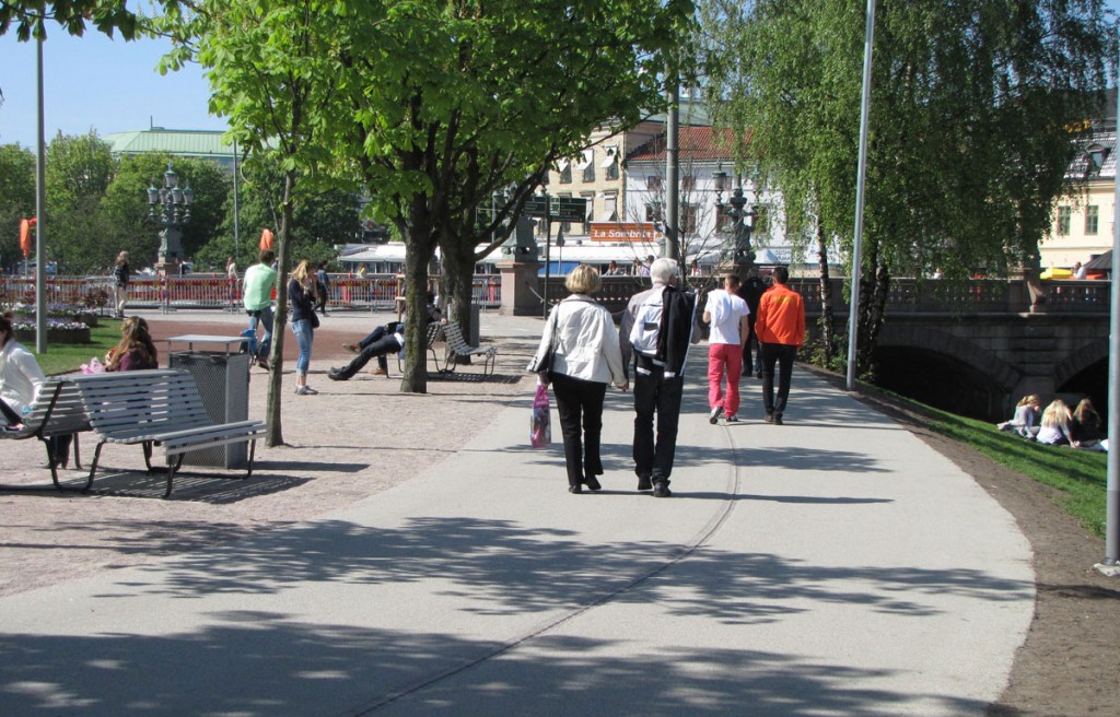
A park (Bältesspännarparken) in central Göteborg. Is it obvious that one of the lanes is a two-way bikeway? If so, which one is it? Answer: The bikeway has unexpectedly the inner curve, the one closest to the park benches.
If you add something that makes the different functions of the two lanes obvious along the full length of the path, a separating strip can work well. But it has to be visually and tactilely distinct.

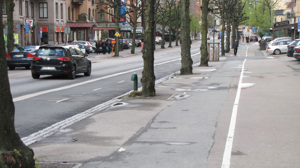
The street Berzeliigatan in Göteborg with its new bikeway to the left of the trees. You can understand that it is meant for bikes because it is the one closest to the roadway and it has a middle line all along. The trees, the strip of paved stones and the difference in surface material makes the pedestrian border clear but still not impenetrable. The sidewalk has space and its own line of sight, and it is inconvenient for pedestrians to flow over to the bikeway. (The white line on the sidewalk used to be the separation for the former bikeway.)
Separating strips must not make too weak resistance against transgression. Too much resistance is not good either, because then it becomes difficult to correct oneself after choosing the wrong way. It would also create problems for road users that really need to cross the border. But the strip must have the power to wake up unsuspecting road users and make them aware of their responsibilities towards other road users in this area.
A separating strip of paved stone, tiles with a small groove or similar will gain effect if a white line is added. It makes the separation more distinct. Then it becomes clear that the strip is not purely aesthetical or is only there to take care of rain water, but has a traffic regulating function. Malin Gibrand from Trivector traffic consultants made a slideshow that illustrates this by examples in slide 10, 11, 13 and to some extent slide 15.
Reflections
We will not be able to separate cyclists and pedestrians with the same method everywhere in Göteborg. But we can nevertheless unify the design principles to a small number of shapes that the road users can learn to recognize intuitively.
Near every bikeway meant for cyclists only, there must always be a pedestrian path as well. Otherwise the designers express that walking is legitimate on bikeways. That ruins the “bikeway trademark”. Even if the pedestrians ended up at the bikeway by mistake, they would have nowhere to go when the bikes come.

At Nya Allén in Göteborg there is a pure bikeway without pedestrian path beside it. Furthermore, pedestrian paths join the bikeway at many places. Such a bikeway, although aimed and marked for bikes only, doesn’t really take cyclists seriously.
It must be obvious that Göteborg regards bikes as a means of transportation that needs its own infrastructure (as stated in the Traffic strategy for Göteborg, page 33 and in the Bicycle strategy at page 61). It will get no credibility in that respect if the design encourages walking on the bikeways.
A bike commuter network will be built in Göteborg for biking at 30 km/h. In this network I think that level difference and a unique color for the bikeways as a rule would work very well, draw attention and promote bike commuting. The same color must of course never occur on any pedestrian surface or mark exit ways for cars or unprioritized bike crossings over a road. It should always express bike priority and nothing else. In suburban areas with low traffic flows, the design might be simpler.
I suspect that there will be no unique bike color in Göteborg. Level separation can anyway give continuous information about which part is a bikeway, but a separating strip cannot convey this on its own. It takes something more to make that clear.
On our normal bike network for 20 km/h, I think that a white line plus tactile separation giving a certain amount of resistance for crossing could often provide enough separation effect. Of course it must still be obvious all along the way which side is the bikeway. A difference in surface material alone is not sufficient.
Narrow pedestrian paths or curves that pedestrians think cause them unnecessary detours will push them over to the bikeway and therefore such designs demand special care. Pavement café furniture and shop’s exhibitions of goods or advertisement signs contribute to a living city but can also force pedestrians over to the bikeway. In those cases we would need a visible limit in the pavement so everybody can see how much space such obstacles are allowed to occupy.
On ways for bikes and pedestrians with low traffic intensity, I can imagine that soft separation is enough. With soft separation I mean a surface without separation line, but with pedestrian symbols painted on one side and bike symbols on the other. The middle area then becomes an asset for the occasion when someone needs extra room – somewhat like the “Room of Requirement” in the Harry Potter tales.
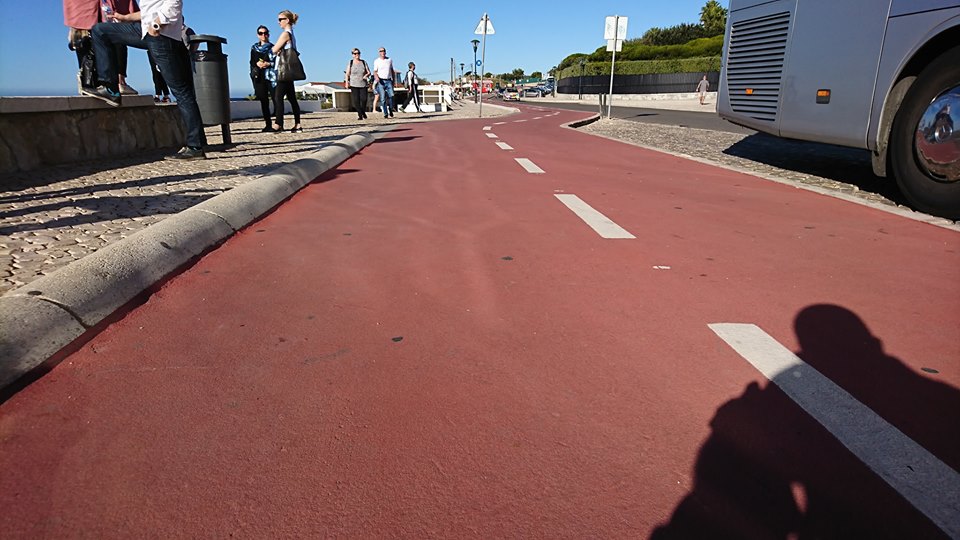
Addition 12/11 2017: Example
A photo by Stefan Brodd from Portugal, showed in the Facebook group Cykla i Göteborg. He gave me permission to show it here:

